

Accordion 2.0: Meet <details>, The Lazy Developer's Dream!
A Step-by-Step Guide to Implement an easy and accessible accordion

Hey there, web accessibility enthusiasts!
Today, we're going to uncover a nifty little gem you might not be familiar with yet: the <details> element. If you're a web developer, you're in for a treat, as this HTML feature can simplify your life and add some flair to your projects! So, let's get cracking and explore what this little guy can do.
🔍 What's <details> all about?
Did you know about <details>? Well, if you didn't, no worries! Let me walk you through it.
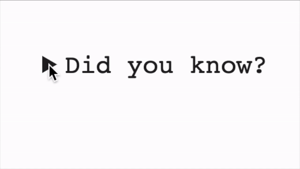
<details>
    <summary>Did you know?</summary>
    You're fabulous!
</details>
When you render this code, you'll see a left-facing arrow with the text "Did you know?" Clicking on this text (or using the space bar when focused) reveals the hidden content, making the arrow point downwards. Clicking it again hides the content. Here's an example:
🔧 Making it yours - Customizing <details>
Now, you might be wondering, "Can I style this to fit my project?" It depends on your needs, <details> comes with a bag of tricks for customization.
You can easily wrap the adjacent children in a div for styling purposes, but you can also keep it simple and dump the content right next to the summary. This makes it incredibly similar to the countless custom accordions you've probably built in the past.
You can even get rid of that pesky black arrow that shows up by default with some straightforward CSS:
codesummary {
    list-style-type: none;
}

summary::webkit-details-marker {
    display: none;
}
Voilà! No more arrow. Just a clean and polished accordion ready to impress your users!
🚧 Limitations? We've got a few...
As with most things in life, there are a couple of limitations to keep in mind when using <details>:
No IE Support: Sadly, Internet Explorer won't be joining this party. If you still need to support IE11, you'll have to come up with a custom solution.
Custom Animations/Transitions:
<details>is fantastic for straightforward projects, but if you're looking for specific UI requirements with the animation, you won’t be able to do too much with the actual text reveal transition without some extra Javascript.Accessibility Considerations: While
<details>is pretty accessible out of the box, there are some issues with screen readers not announcing the revealed text correctly. Hassel Inclusion discovered the element wasn't working properly by testing it in 2019, which revealed that screen readers don't always announce the text properly, so unsighted users might not even know what it's for. To work around this, you can try adding extra markup and a little Javascript to make the expanded text a live region when it is expanded, or perhaps just move focus on expansion to the new text.
At that point, you're basically making a custom component if you need any of the three limitations. In that case, follow Hassell Inclusion's suggested pattern if you need a more "complex" approach!
🌈 Embrace the Power of <details>!
Despite its limitations, <details> is an exciting addition to your HTML toolkit. Its native accordion-like behaviour saves you from reinventing the wheel and is widely supported in modern browsers. If you want to add some interactive content to your website without the hassle of custom scripts, this is a fantastic solution!
So, next time you're working on a project, give <details> a chance to shine. Embrace its simplicity, and you'll be amazed at the delightful interactions it brings to your web pages. Happy coding! 😎🚀
Want to know more?
Hassell Inclusion's accessible accordion by Graham Armfield
Hassell Inclusion's <details> investigation of the pro and cons of the element
MDN Web Docs about <details> and <summary>
I hope you find this article engaging and informative! If you have any questions or suggestions for future topics, feel free to reach out. Stay curious and keep exploring the ever-evolving world of web accessibility! 🌐


